Logo Design - L & O Platters.
During the isolation of 2020, we saw a boom of small scale catering delivery businesses opening up, offering delivery of a range of items including donut boxes, charcuterie and self-care boxes, aimed at households to bridge a gap that lockdown had created and allowing customers the opportunity to have ‘a night out’, at home.
L & O Platters was one such business. Started by two young women, they opened up a catering business targeting families in Western Sydney. I was approached to create a logo for their new startup, to represent the business and emphasise their values, ‘Gourmet, Accomodating, Vibrant, Fresh, Dynamic, & Family’. They would be promoting this new business primarily through word of mouth, instagram, and facebook.
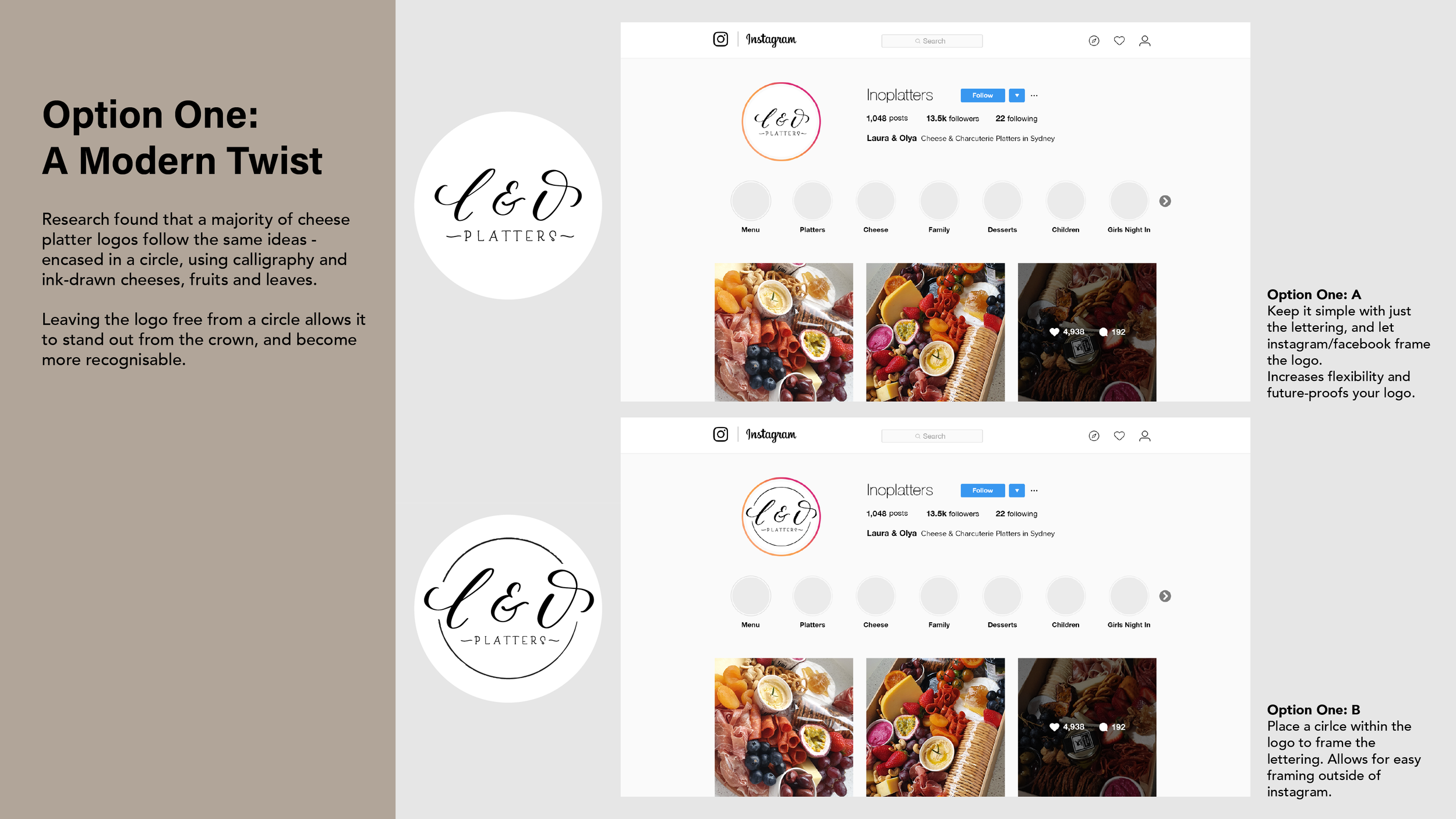
Research found clear commonalities between most logos in this industry, circles, thin black outlines, hand written or personalised fonts, and simple illustrations of cheese, knives or leaves. Many logos in this industry are very similar and difficult to distinguish, it was a challenge to show the client what they needed, rather than what they wanted.
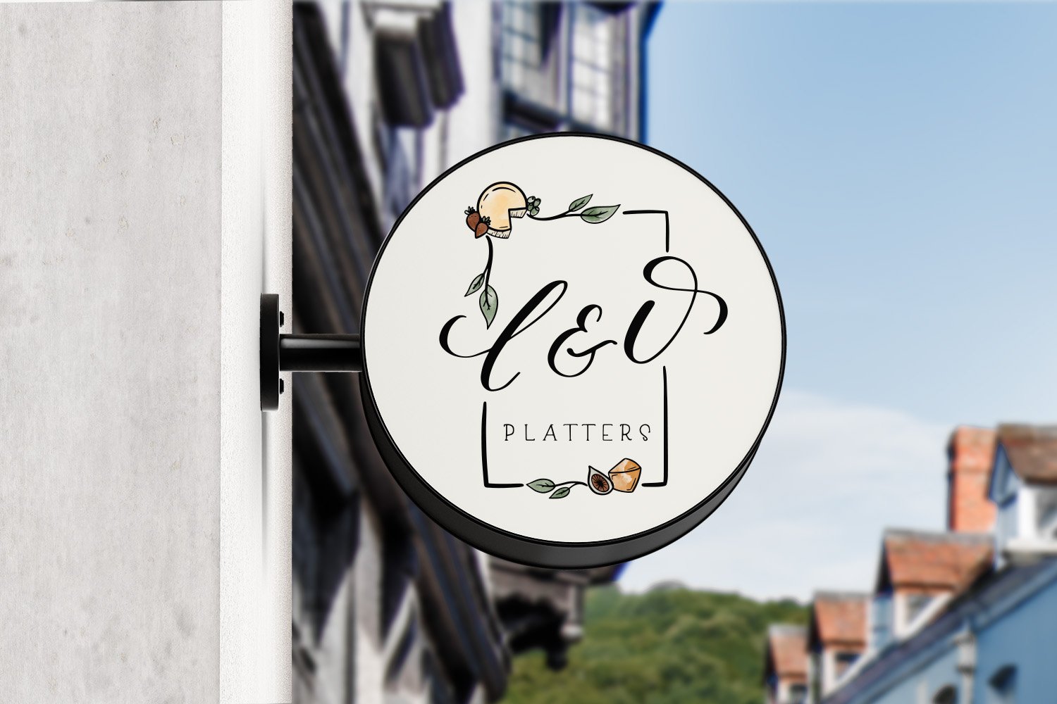
The final logo incorporates the traditional calligraphy, combined with a more modern, hand-written type, adding a personal and more intimate, familial feel. The logo is framed by a rectangular box, symbolising the packaging used for their product, and simultaneously setting their logo apart from others in the industry.